Trenord
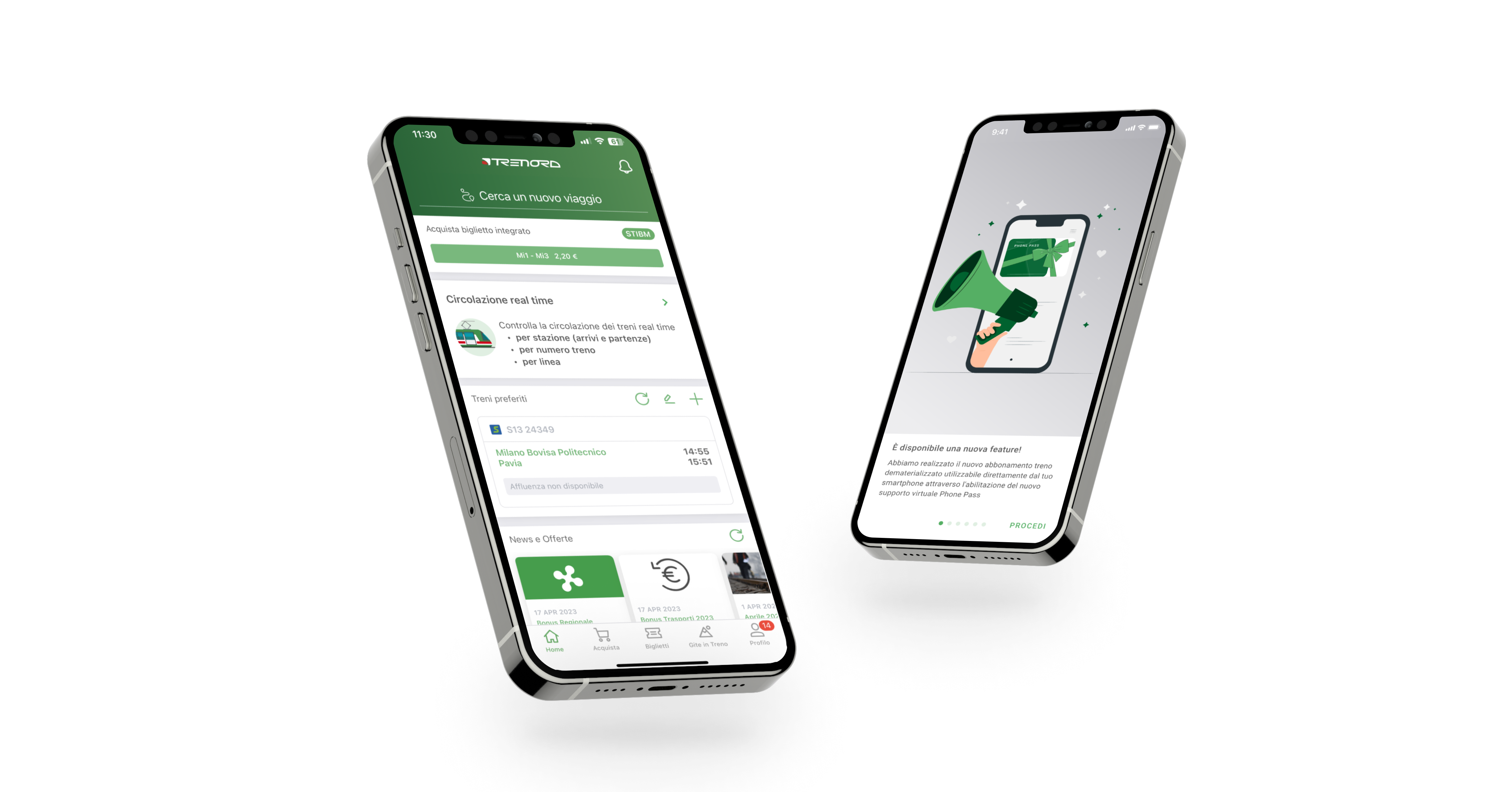
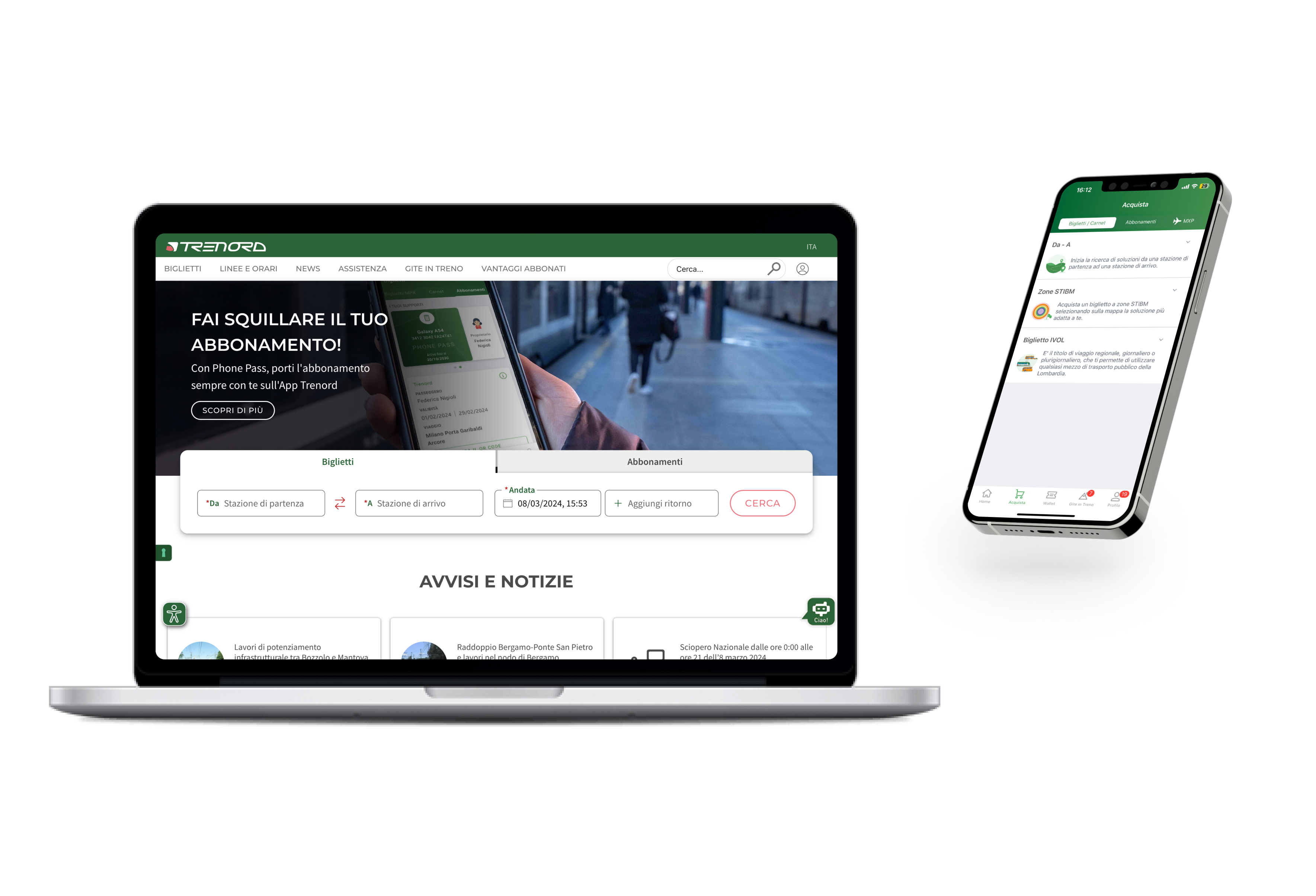
The contents published refers to Trenord touchpoints currently live in production, accessible to all. They were designed by me with the collaboration and supervision of the Mia-Platform teams.
A.Y. 2021-Now
Throughout my professional experience, I have had the privilege of acting as the lead UX/UI designer for one of my company's prominent clients: Trenord, the main railway service company in Lombardy Italy. In this role, I was tasked with orchestrating and curating the user experience across all customer digital touchpoints, from web to mobile app, ensuring consistency and quality at every stage of the journey by elevating usability, accessibility and fostering user engagement.
The Products
I contributed to shaping the digital experiences and touchpoints now available within the Trenord product, spanning its web app and native app. The main challenge lies in crafting a product capable of resonating with and understanding a diverse user base, given the wide spectrum of individuals utilizing the app and website for transportation needs. The key solution entails designing from a user-centric perspective, aligning with the mental models of end-users. The outcome of this approach manifests in straightforward and user-friendly UI touchpoints, facilitating interactions, gestures, and basic actions accessible even to those with limited digital proficiency.
The process
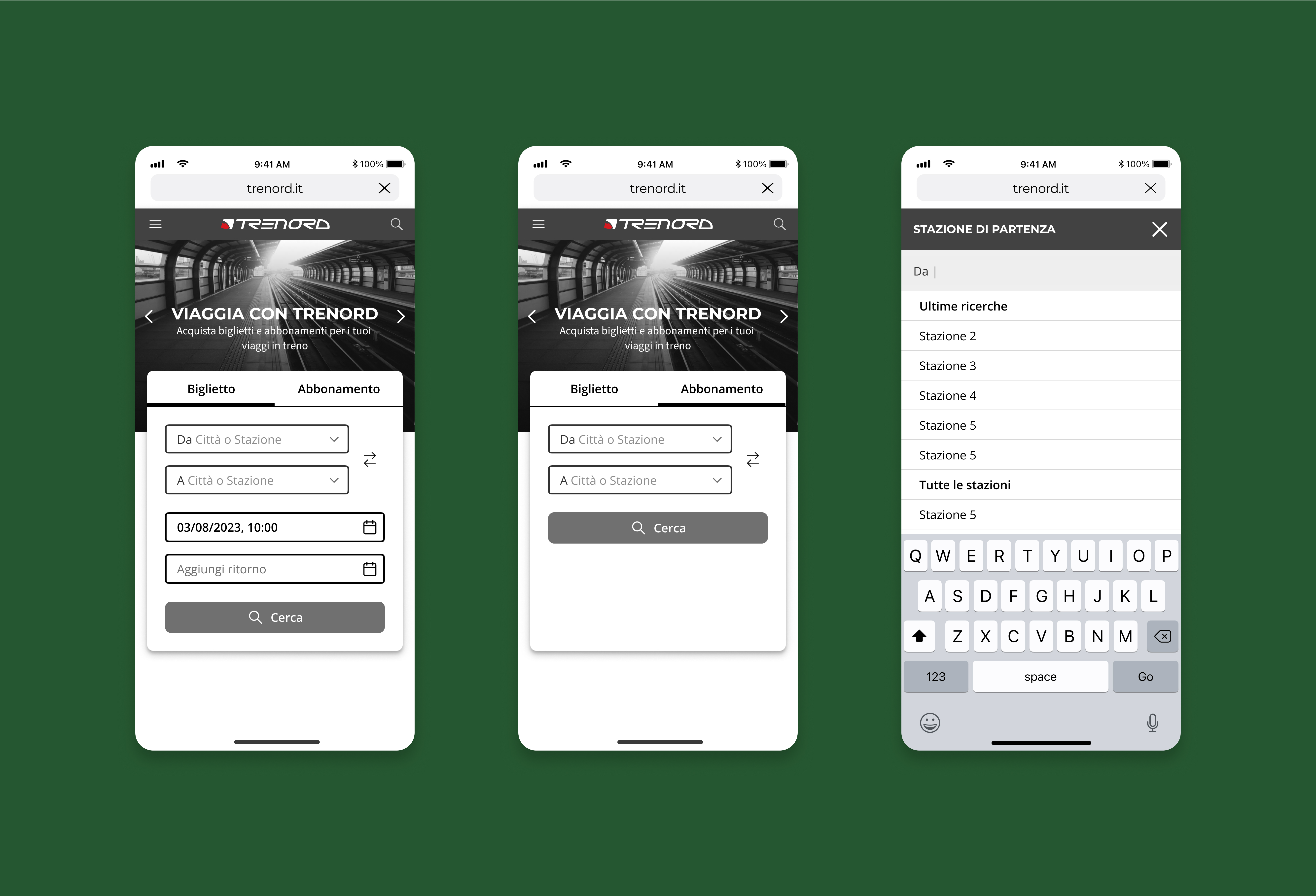
The design journey commences with a thorough examination of the client business objectives, identification of user pain points, and exploration of opportunities for product innovation. Prior to crafting detailed UI mockups and specifications, an array of preparatory tasks ensue to ensure the delivery of optimal solutions: from user research and benchmarking to crafting interaction flowcharts, wireframes, and progressively detailed interfaces. These interfaces serve as the foundation for prototyping and user testing. Through a cyclical, agile, and iterative approach, we navigate towards solutions that not only resonate with users but also drive revenue and catalyze product innovation.
The last feature: Phone Pass
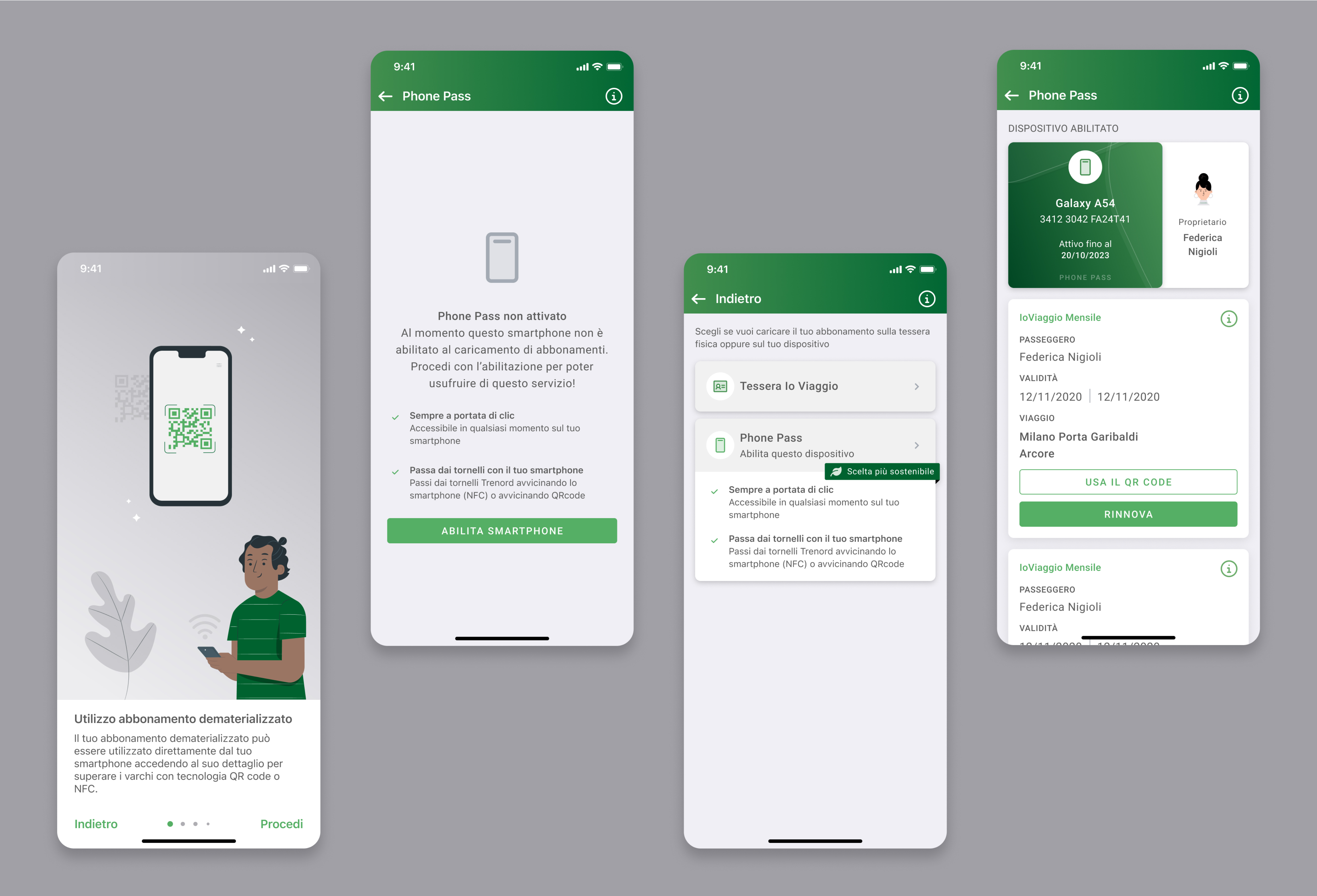
Introducing Phone Pass, the latest feature I've contributed to, designed to enhance the commuting experience for Trenord passengers. This innovative digital subscription, available exclusively on the app, eliminates the need for physical cards, streamlining the process for users. The commitment to sustainability and user convenience is underscored by the transition to a fully digital and dematerialized rail subscription, removing the requirement for physical cards and station activations. With Phone Pass, commuters can enjoy seamless access to their rail subscription directly from their smartphones.
The accessibility
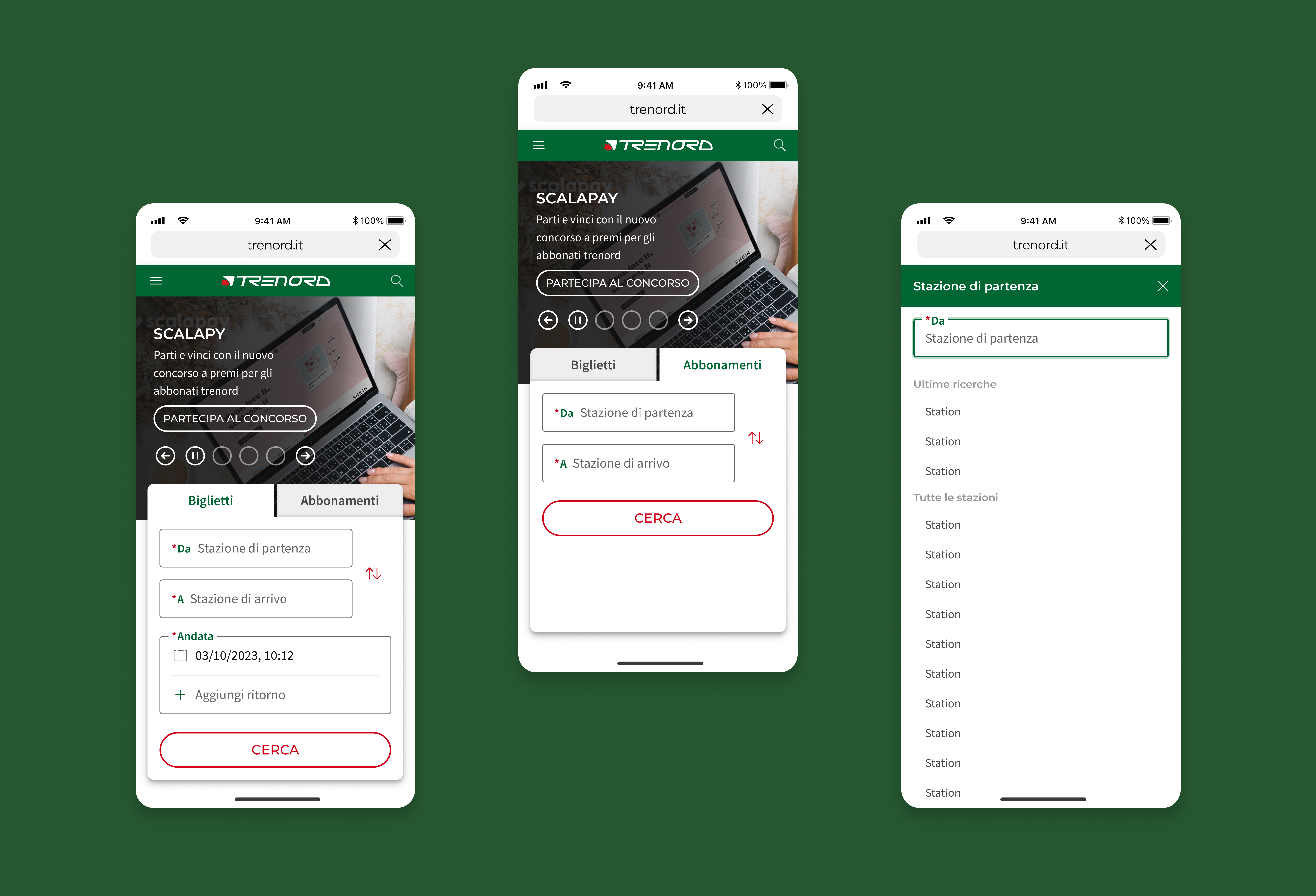
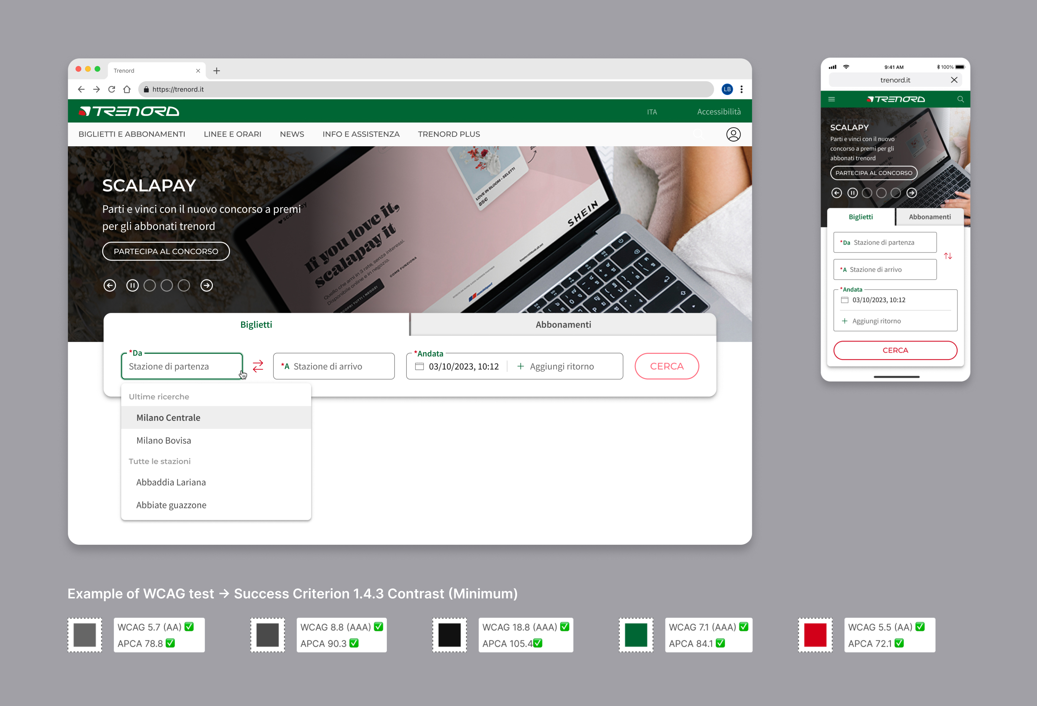
Over the past few months, I've been studying the WCAG guidelines, ensuring that the typography, colors, and all the new components of the Trenord widget I designed would have met the accessibility standards. Through a deep research, iteration, and focusing on mobile-first design we've crafted an accessible, consistent and optimal user experience regardless of the device used. It's crucial to highlight how much in 2024 it's important for designers to produce accessible and inclusive artifacts guaranteeing a better experience for users with disabilities and enhancing a smoother and intuitive one for everyone.
The Design System
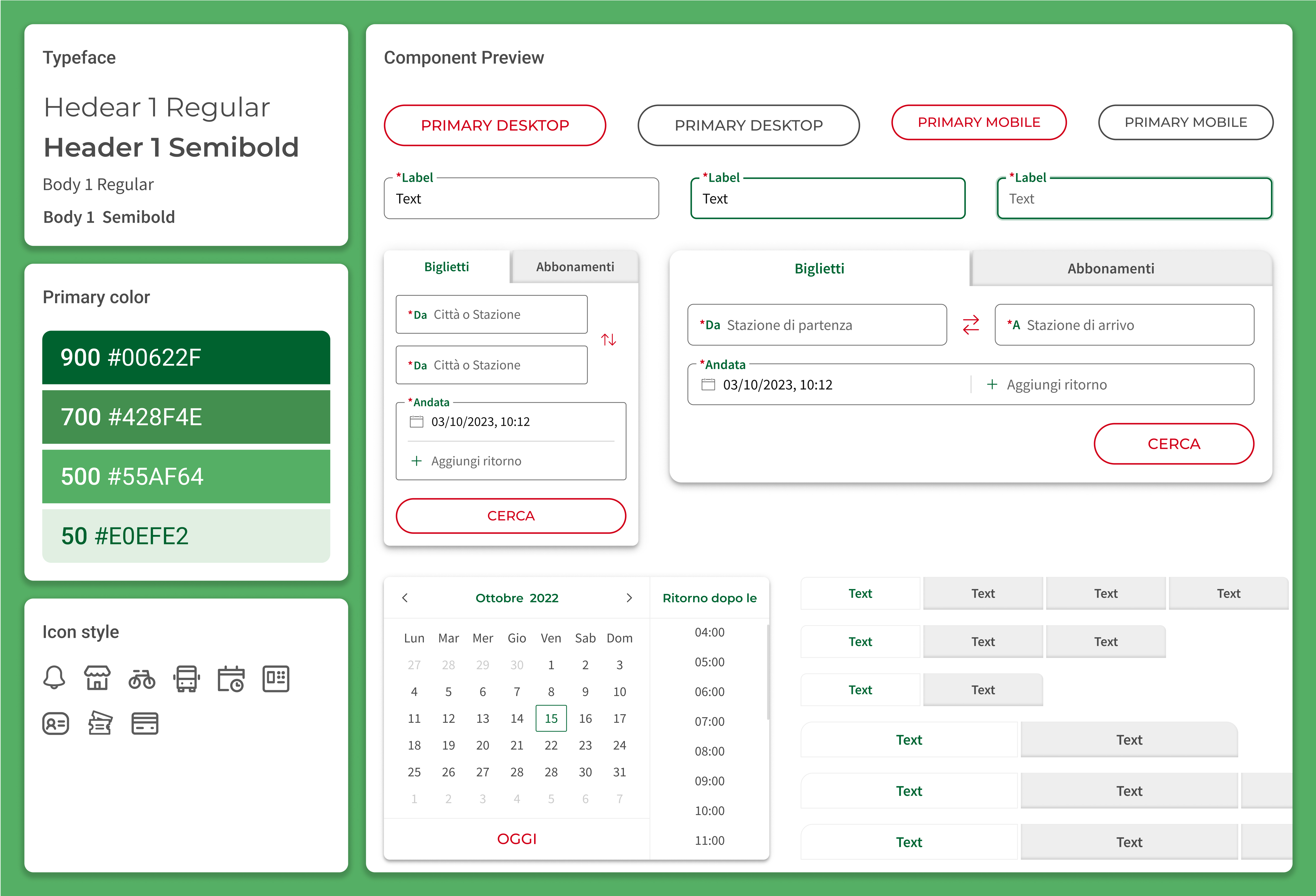
I played a key role in developing a robust, scalable, and user-friendly Design System using Figma software. The UI components were crafted following the standards and best practices of renowned Design Systems, customized to suit the requirements of our product, brand, and end-users. Emphasis was placed on ensuring their responsiveness and adaptability to various layouts, achieved through advanced utilization of AutoLayout and the creation of component variants to anticipate all potential scenarios. In crafting the Design System, my focus remained steadfast on the mental models of our target users, striving to ensure ease of use and visibility of actions, with no hidden interactions.