Mia-Platform
The contents published refers to Mia-Platform touchpoints currently live on their website accessible to all. They were designed by me with the collaboration and supervision of the Mia-Platform teams.
A.Y. 2021-Now
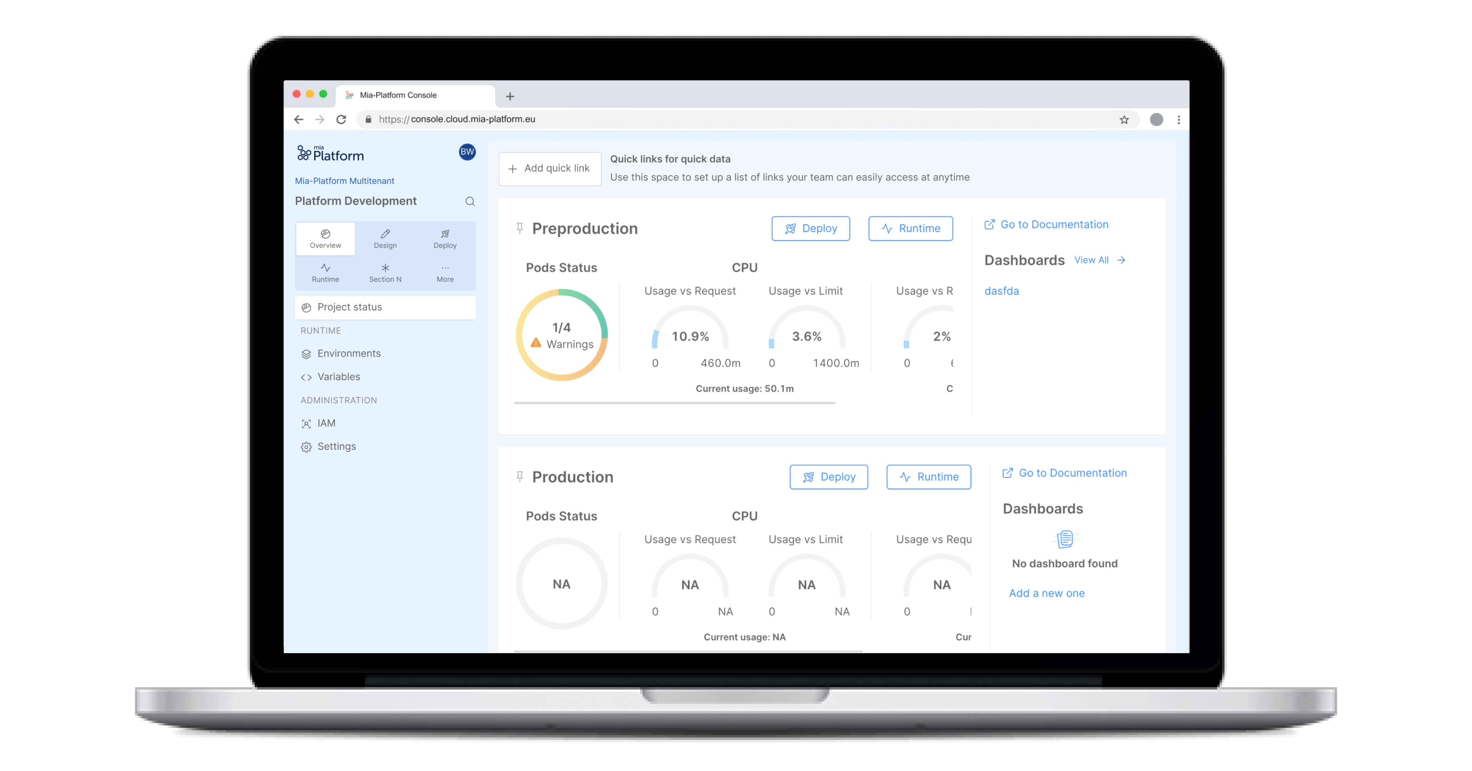
Mia Platform is a technology company that develops an Internal Developer Platform (IDP). It streamlines software templating, enhances the developer experience, provides golden paths, expedites software releases, and fosters knowledge sharing. As a UX/UI designer, I've been with Mia Platform for three years, working to improve the product's usability and design. My role involves crafting intuitive interfaces, simplifying workflows, and collaborating with diverse teams to create a seamless developer experience.
The approach
I played a pivotal role in elevating the developer experience within Mia Platform, focusing on our Internal Developer Platform (IDP). The primary challenge was designing a solution that could effectively serve a diverse developer community, given the variety of tools and practices across different teams. Our approach involved putting developers at the heart of the design process, ensuring that the platform's layout and functionality aligned with their thought processes and common workflows. This approach resulted in a more intuitive and streamlined interface, enabling developers to easily navigate, integrate, and operate the tools they need, regardless of their experience level or technical background..
The process
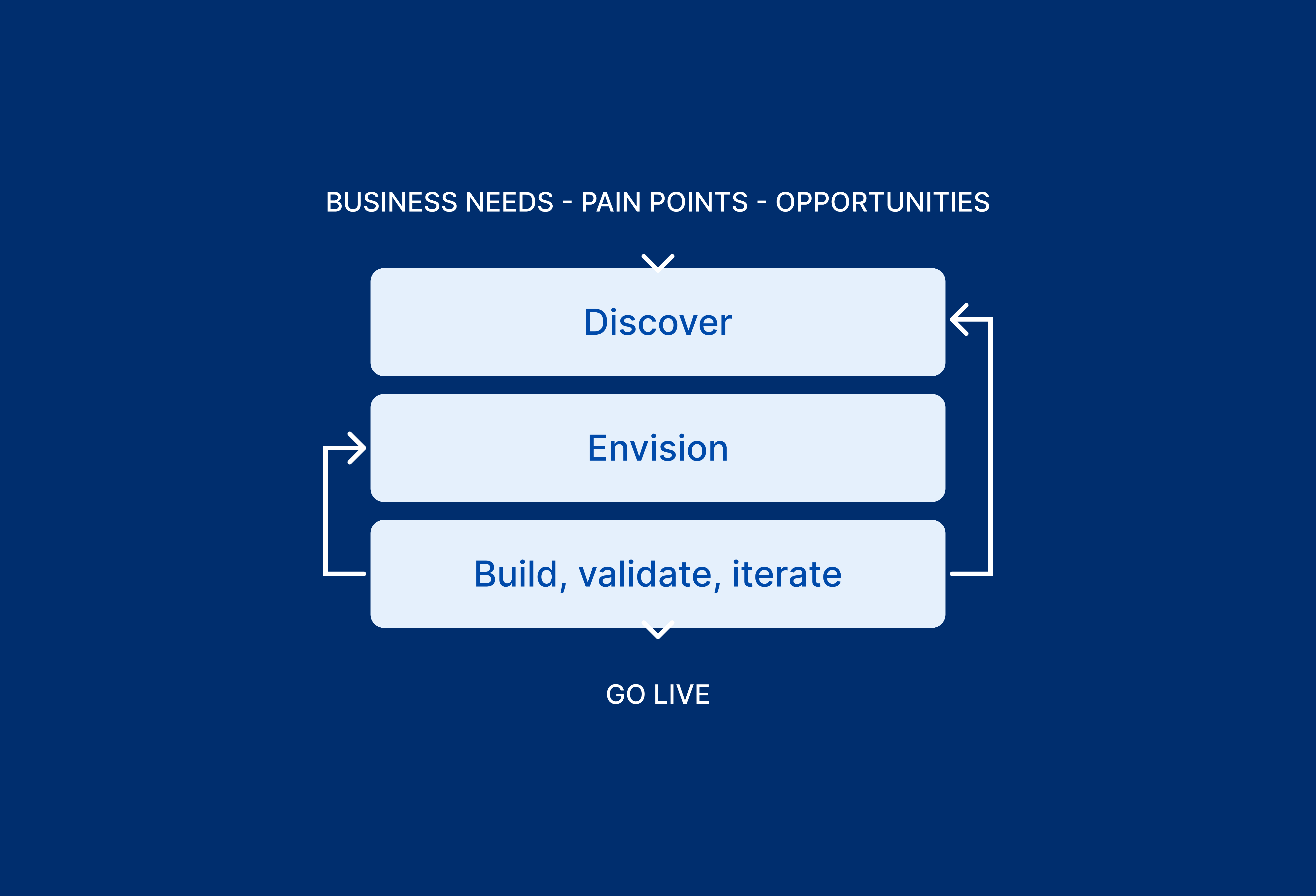
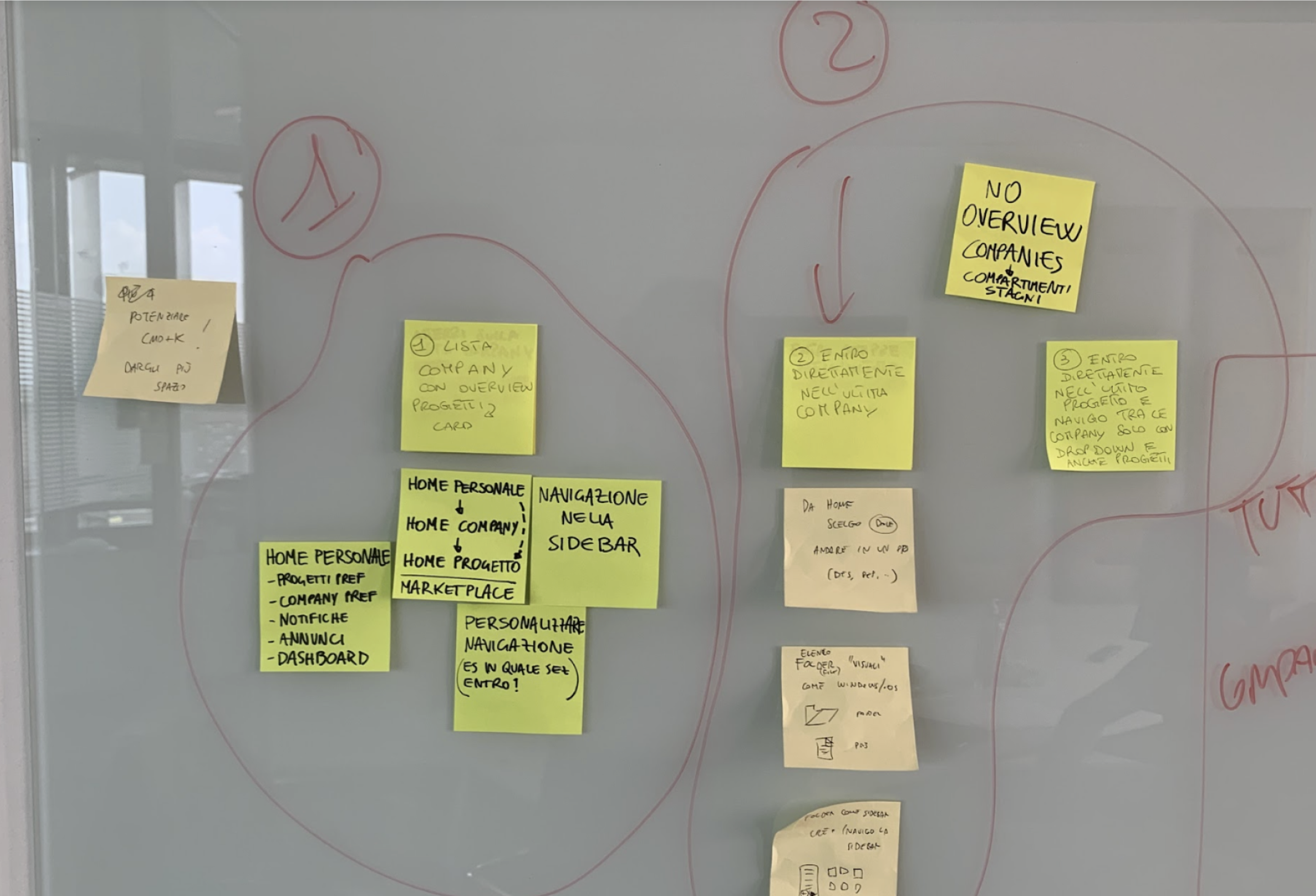
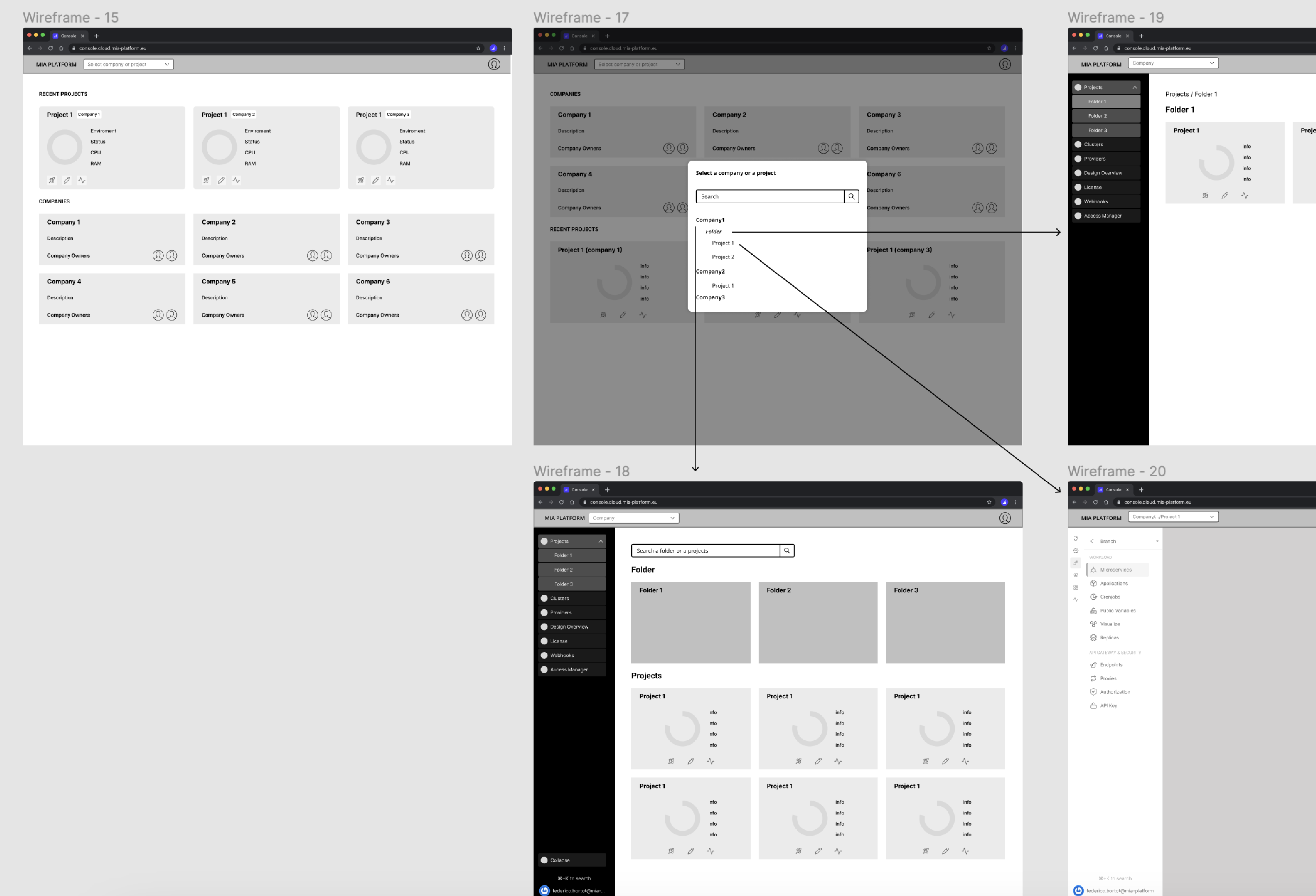
The design journey at Mia Platform begins with a thorough analysis of business objectives, identification of user pain points, and exploration of opportunities for product innovation. Before diving into detailed UI mockups and specifications, we engage in key design activities such as user research, competitive benchmarking, interaction mapping, and wireframing. These foundational elements guide our design and development processes, laying the groundwork for prototyping and user testing. Using an agile and iterative approach, we ensure that each project iteration aligns with both user needs and business goals
Improve user navigation
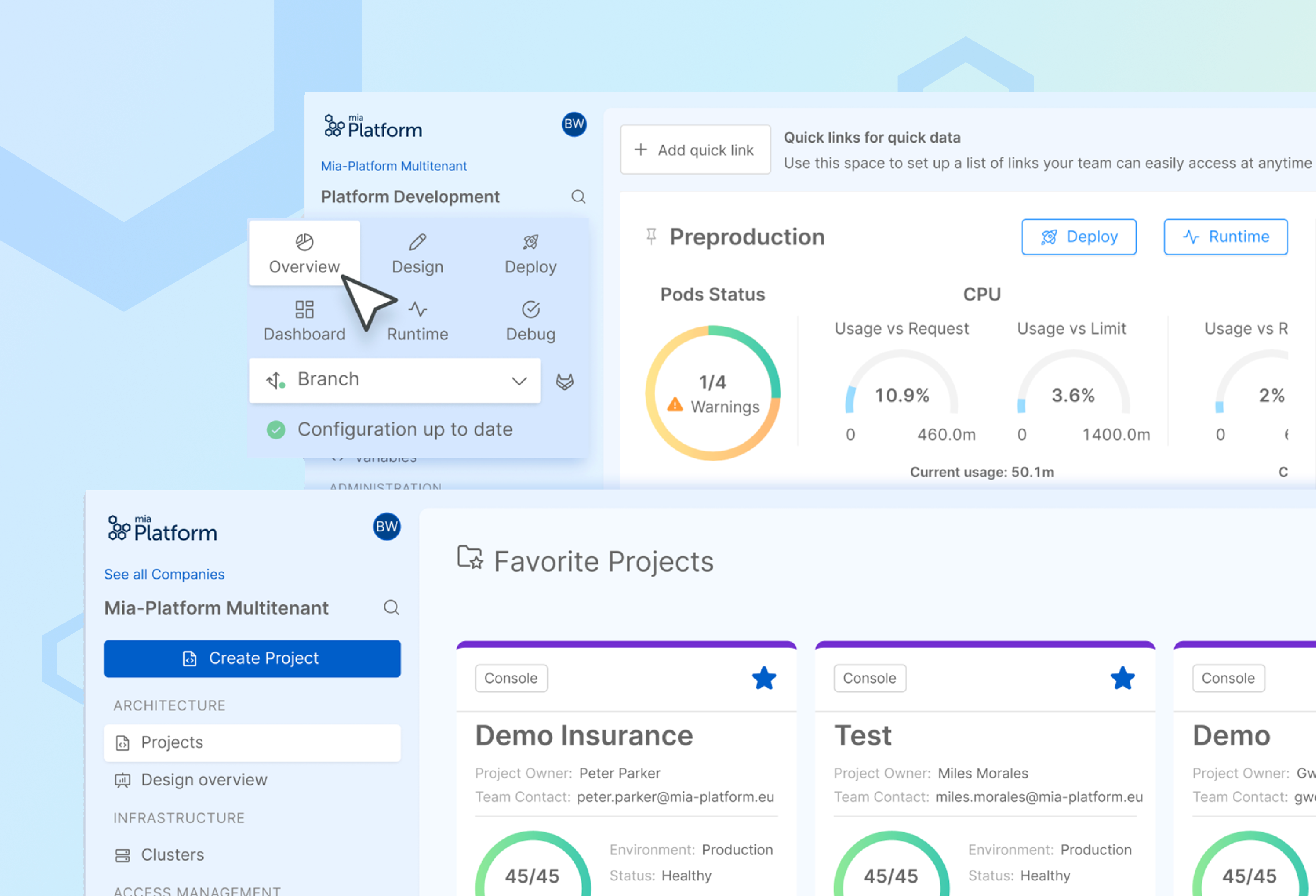
We conducted an in-depth analysis of user behavior and prior UX data to completely overhaul the navigation within the Mia-Platform Console, bringing substantial benefits to developers. The changes include a more focused developer experience, a streamlined user flow, and a redesigned workspace that has become the central focus of the product. This new approach significantly reduces cognitive load and makes it easier for users to navigate between sections and areas within the console. The result is a more efficient and user-friendly environment for developers
The Desing system
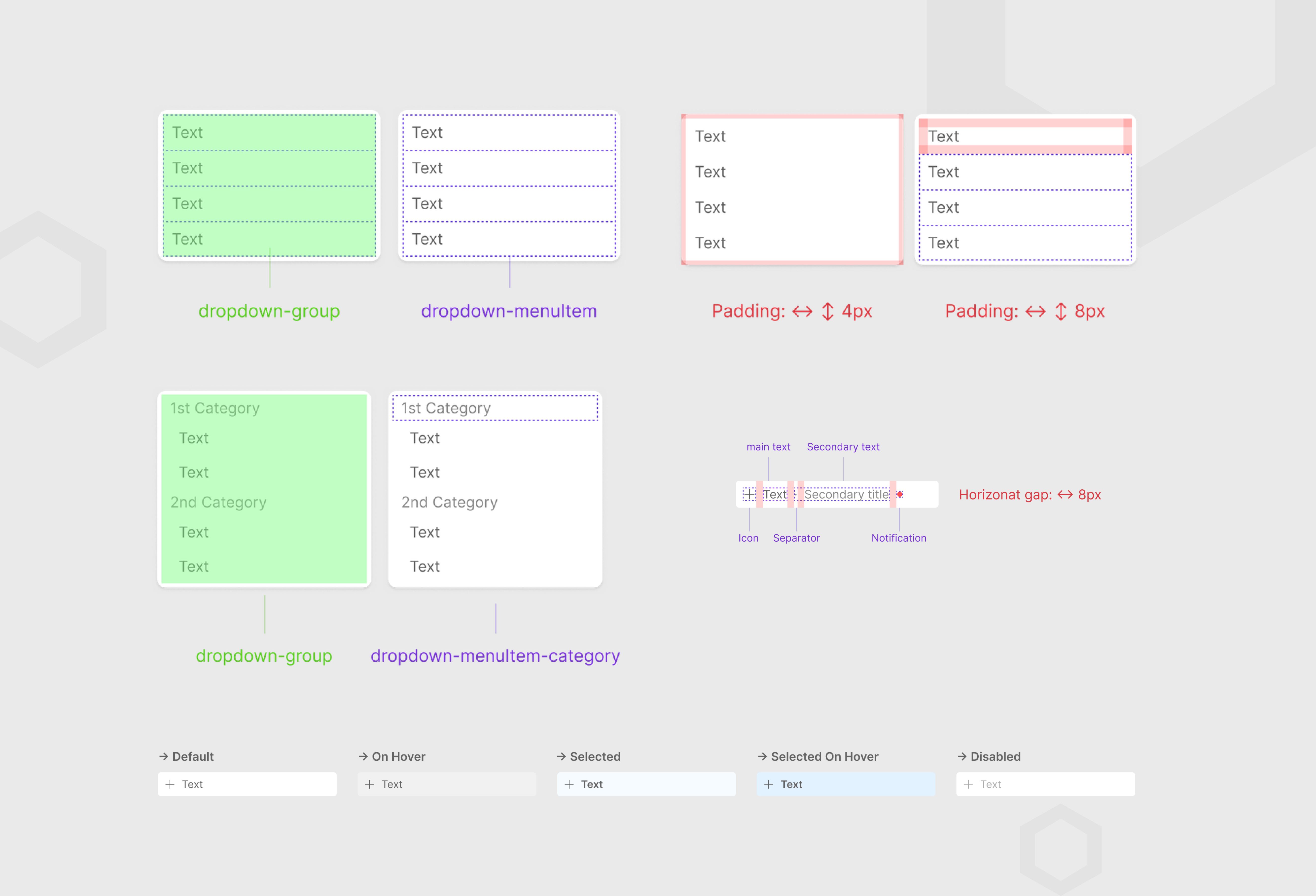
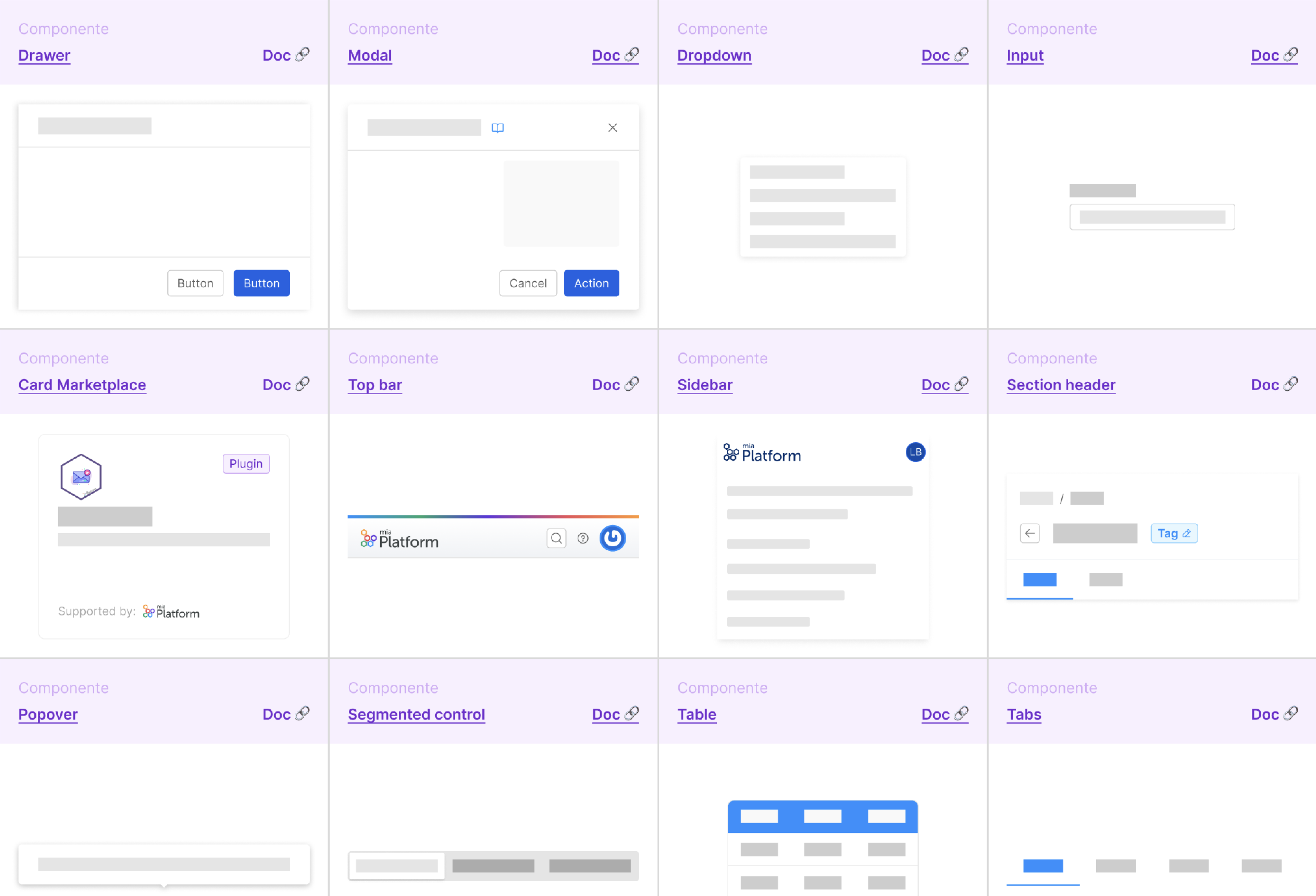
I played an instrumental role in building a robust and user-friendly Design System. Designers and developers have collaborated closely to refine these components, enhancing their responsiveness and improving their overall performance. My focus was on ensuring the Design System's adaptability across various layouts. Throughout this process, we emphasized continuous improvement, regularly updating the system to keep pace with Figma's new features and functionalities. The goal was to make the Design System increasingly accessible and usable for the design team while maintaining a user-centered approach that aligned with our product and end-users.
