GLS Redesign
Arianna Meroni, Martina Platini, Nardin Shafik, Raja Khilnani
GLS
A.Y. 2020-2021
Guided by the heuristic principles and trough a deep analysis of the current website of GLS, we designed a new GLS website approaching the redesign taking into consideration all the problems in the original one, our users, the parameters selected, and the three main tasks we identified.
Why
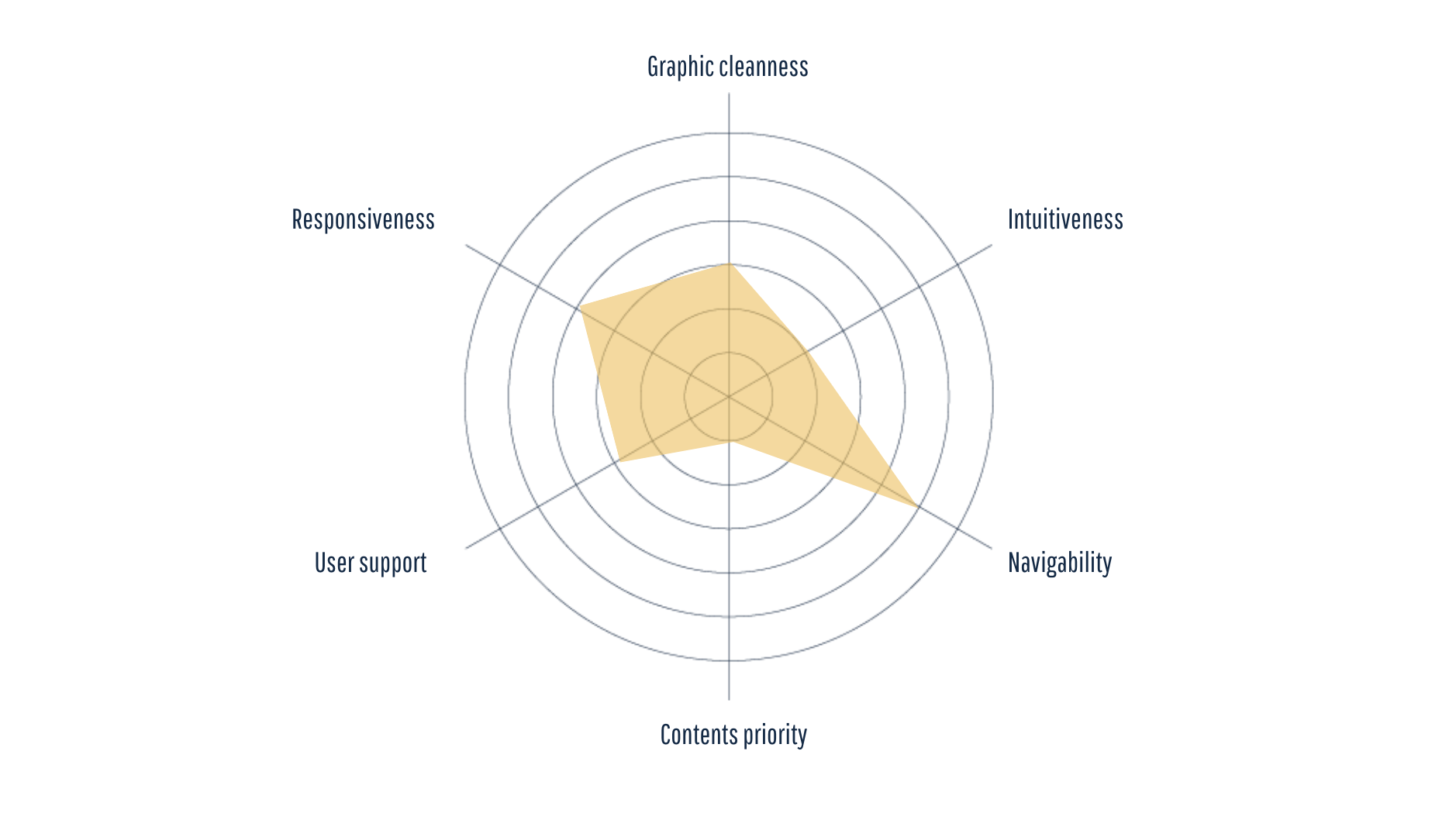
Analyzing the current GLS website we realized that it lacked intuitive. It is difficult for the user to find the information he is looking for a while, the navigation is not smooth, the website is full of text and information that don’t make it easier for the user to use it. This has brought out the need for a redesign of the current website.
The process
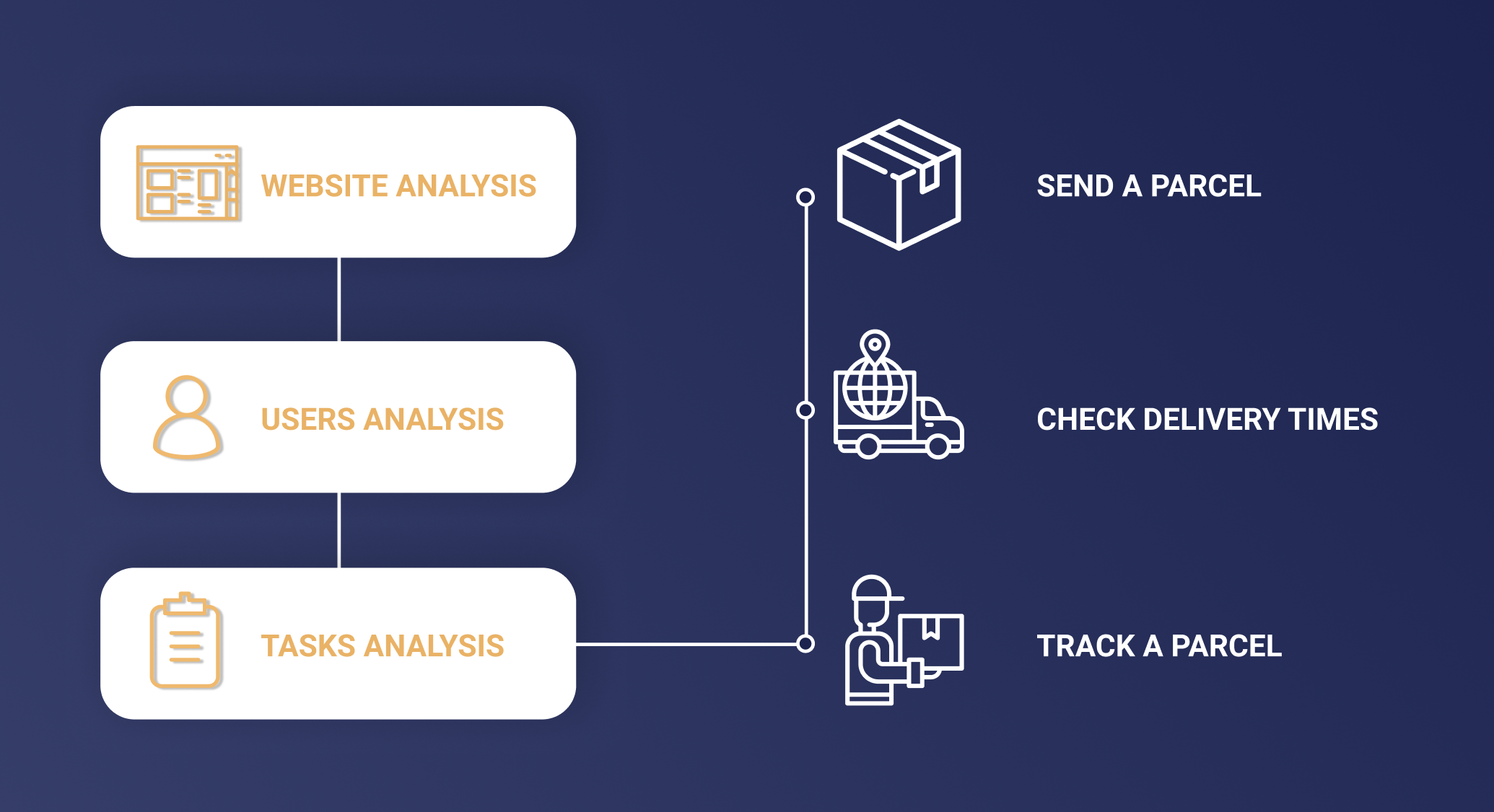
We analyzed the GLS website to understand what services were offered. Thanks to a careful analysis of users, through the creation of personas, empathy maps, personas tasks and personas-tasks matrix, we have identified which are the most important tasks for users to perform on the website. Considering the principles of heuristics, we analyzed in depth the tasks identified both on GLS website and on those of its competitors. So finally, we approached the website redesign taking into consideration all the problems in the original one, our users, the parameters selected, and the three main tasks we identified.
Main Tasks

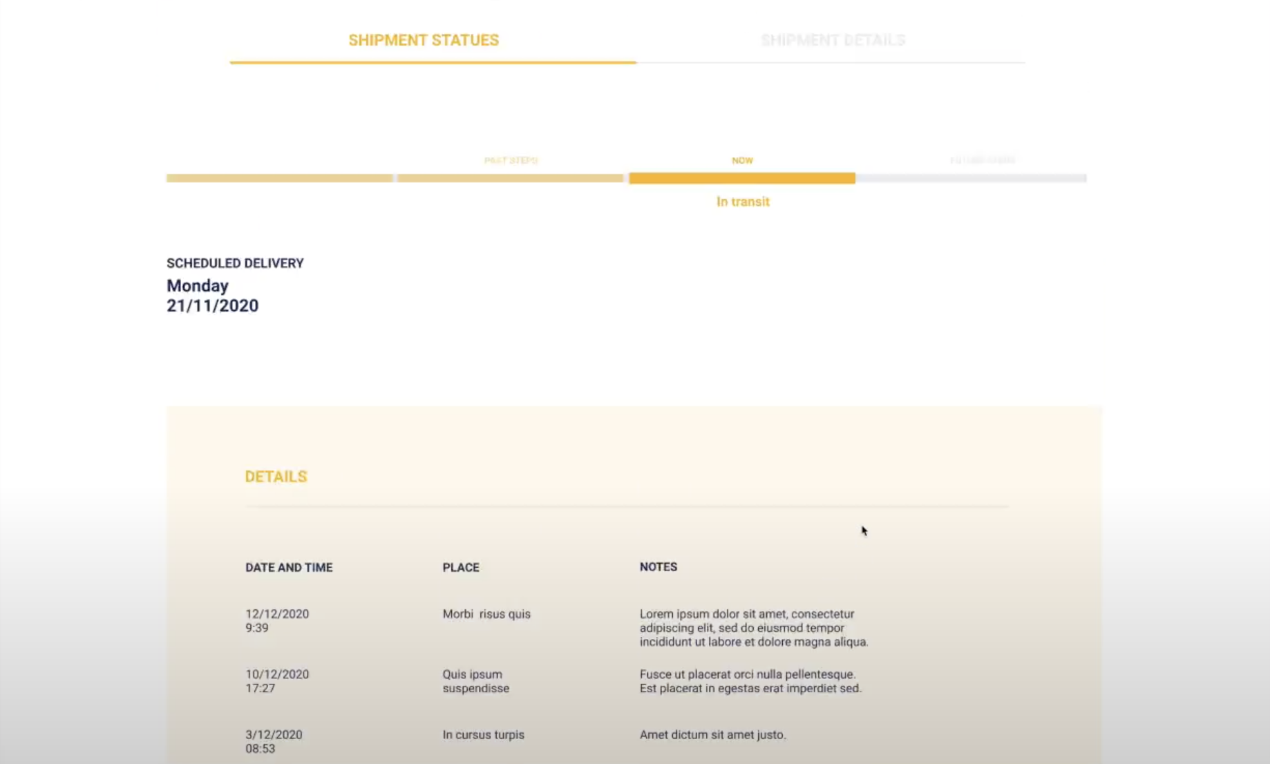
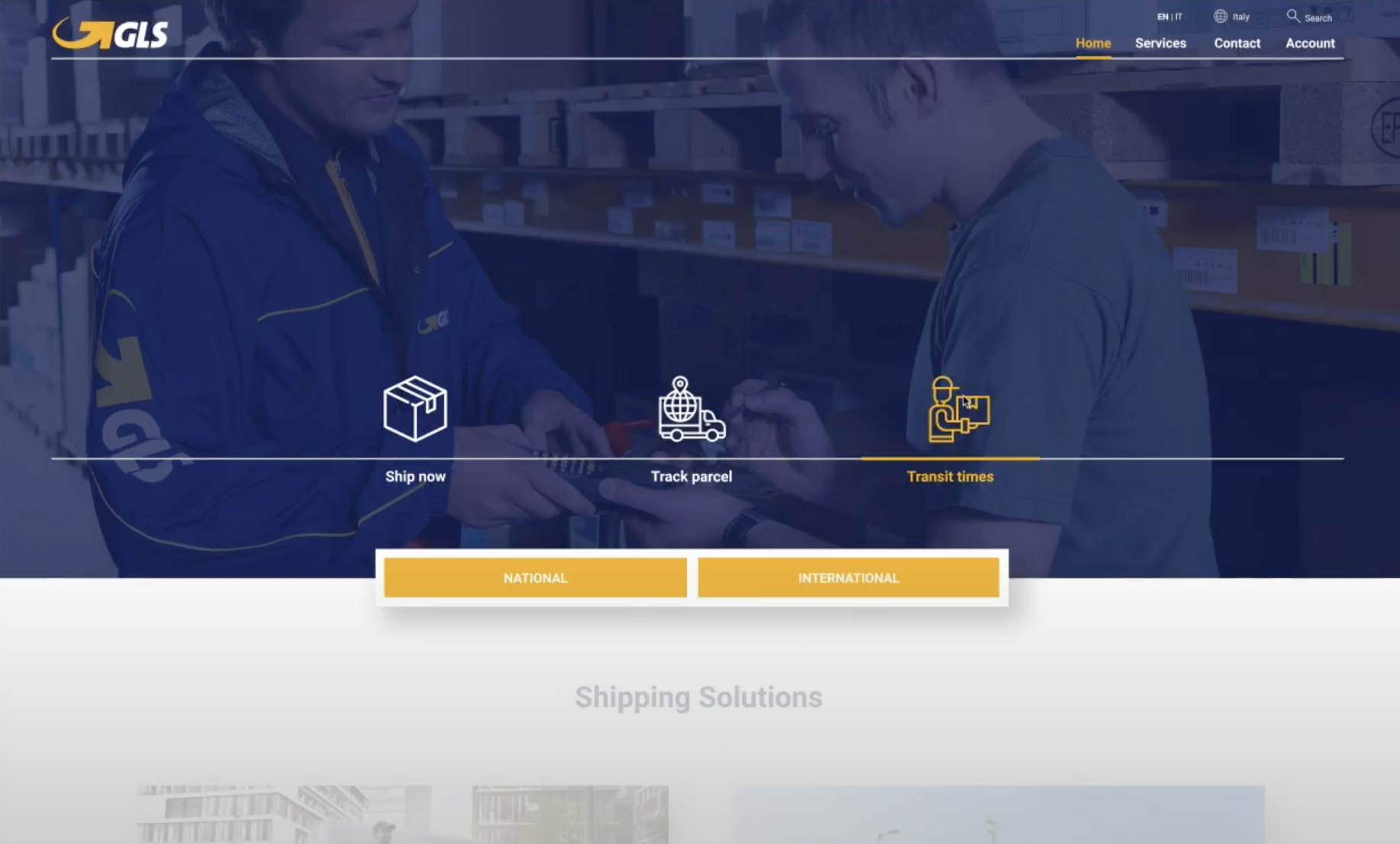
The redesign
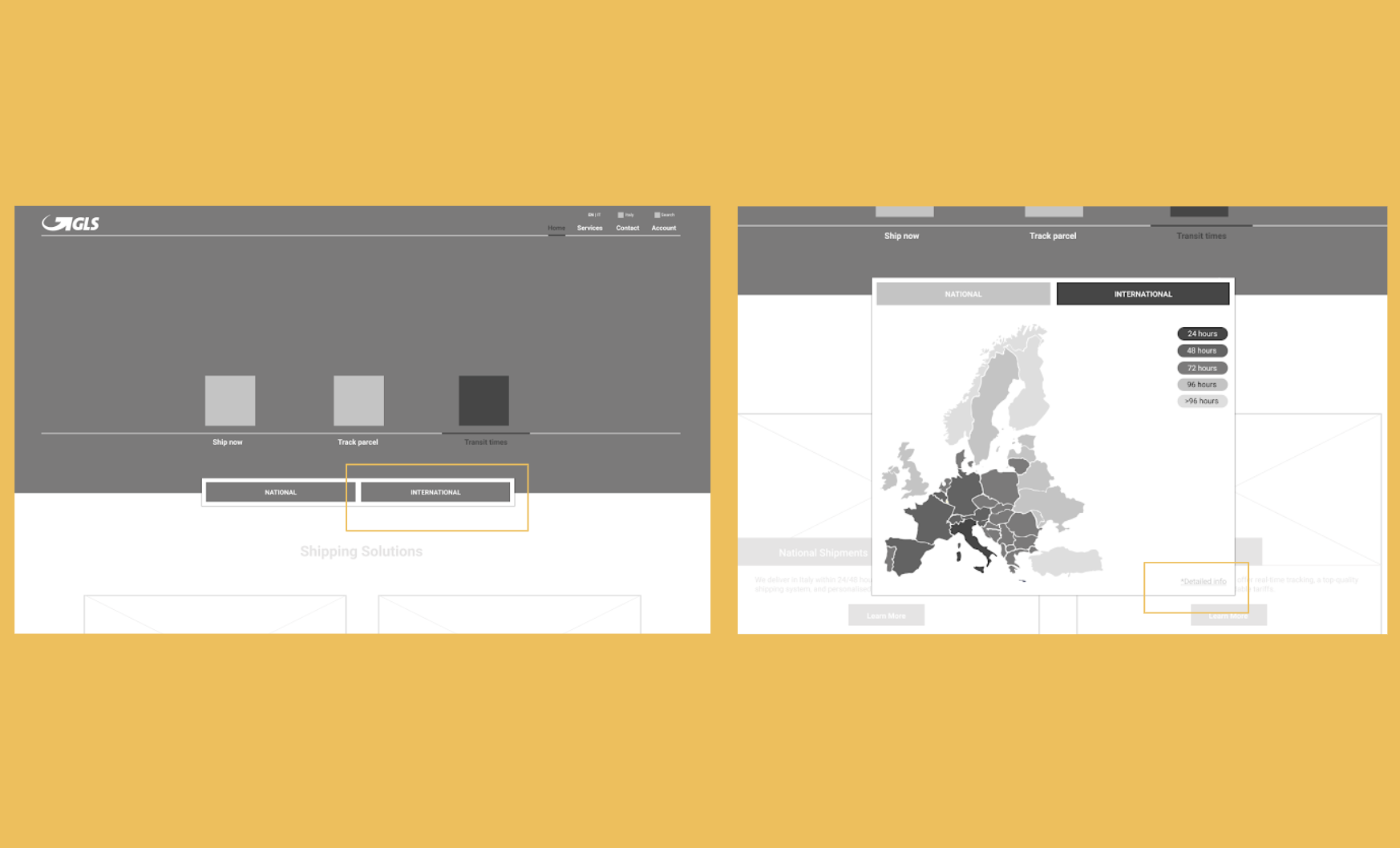
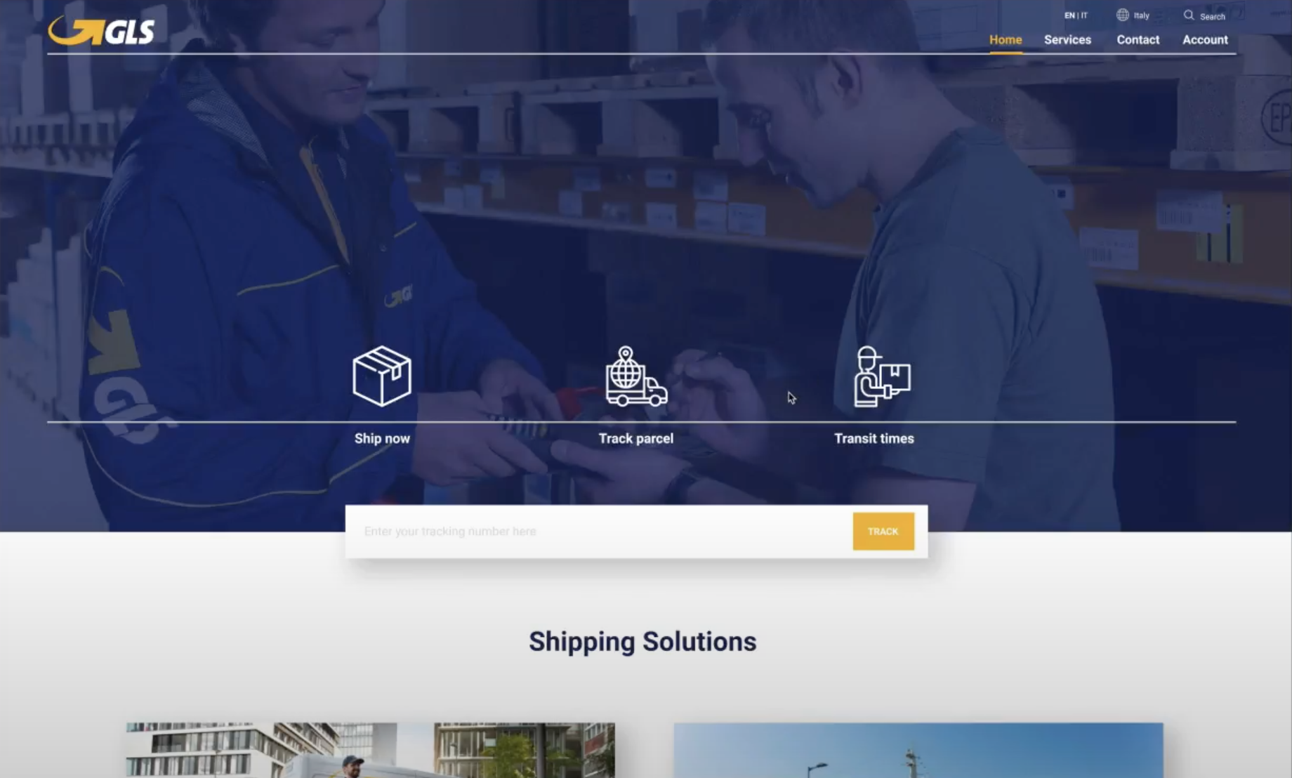
We redesign GLS in a way that it is easier and more fluid for the user to navigate, providing a clear and pretty straightforward navigation and experience for the users, adding feedback, and changing the overall design of the website so it’s more bold, clean and using contrasting colors based on GLS branding.
My Role
My overall role included being an active part of all stages the project. I was in charge of analyzing a part of the current website, to develop one of the personas and part of the presentation. I designed the wireframes and the UI of the homepage and all the ones of the check delivery times task. Finally, I developed the prototype.
Pains
This was our first time in redesigning an existing website and since it was not requested, we didn’t test the prototype. This for me was a lack and it didn’t give us the possibility to understand if the usability was really improved.
Takeaways from the project
Developing a website for the first time, made me realize what needs to be considered while redesigning an existing website. I discovered and applied the usability principles, the heuristics.